Dashboards in Model driven apps
- ALIF Consulting

- Mar 30, 2022
- 3 min read
Updated: May 20, 2024
Dashboards are collections of charts relating to Microsoft Data versus tables.
There are two types of dashboards :
User dashboards
System dashboards.
An app user can create a dashboard that is visible only to them in the app areas where they have privileges.
An admin or customizer creates or customizes system dashboards that, when published, are visible to all app users.
A user can choose to set their user dashboard as their default dashboard and override the system dashboard.
Dashboards can be standard or interactive
Standard dashboards support adding one or more unrelated components, such as charts or lists.
Interactive dashboards provide the capability for users to act on a particular row directly from the dashboard.
Create a new Standard Dashboard

Sign into Power Apps (make.powerapps.com).
Select Solutions, and then open the required solution.
On the toolbar, select New, select Dashboard, and then choose one of the following layouts :
2-column overview
3-column overview
3-column overview (varied width)
4-column overview
Power BI embedded
In the Dashboard: New page, enter a name for the dashboard.
Select one of the component areas and then select the icon for a chart or a list.
Up to six components can be included in a dashboard.
For example, to add a chart, select the chart icon on the tile of the dashboard canvas where the chart needs to appear. Then, in the Add Component dialog, select values for Row Type, View, and Chart. Then select Add to add the chart to the dashboard.
When finished adding components to the dashboard, select Save and then Close.
On the solution toolbar, select Publish.

Edit an existing dashboard
1. Sign in to Power Apps
2. Select Solutions, and then open the required solution.
3. In the list of solution components, open the dashboard, select one of the component areas, and then on the toolbar, select Edit Component.
4. In the Set Properties dialogue box, make changes to a chart or list, such as changing the table and default view, adding a chart selector, or making the dashboard available on mobile apps. When done, select OK.
5. When the changes are complete, select Save and then Close.
6. On the solution toolbar, select Publish.
Configure a multi-stream interactive dashboard using the 4-column layout
1. Sign in to Power Apps
2. Navigate to an environment with an unmanaged solution.
3. Select Solutions, open the solution required, and then on the toolbar, select Switch to Classic.
4. In the left navigation pane, select Dashboards; on the toolbar, select New, and then select Interactive Experience Dashboard.

5. Choose the layout, either 2, 3, or 4-column width.
6. When the dashboard form opens, fill in the filtering information at the top of the form, as shown here.

Filter Table: The visual filters and global filter attributes are based on this table.
Table View: The visual filters are based on this view.
Filter By: The column to which the time frame filter applies.
Time Frame: The default time frame filter value for the Filter By column.
After the information has been specified for filtering, start adding components for the charts and the data streams. To add a component, simply select the element in the centre of the chart or stream, and when the dialogue appears, select the required information from the drop-down list, as shown in the following illustrations.
Add the Cases By Priority doughnut chart

Some charts, such as bar charts or pie charts, render showing the data stored in the system. The doughnut charts and tag charts load as static images and don’t show a preview of the actual data.

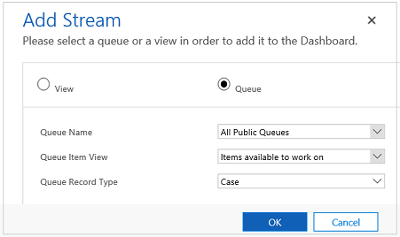
Next, configure the streams. Just like with adding components in the charts, select the element inside the stream panel. When the dialogue appears, select View or Queue, depending on what element you want the stream to use. Enter the required information, as shown in the following illustration.
Configure the stream for the Items available to work on as shown here:

The following illustration is an example of a fully configured chart panel and stream panel :

After the dashboard has been completely configured, save it and publish the customizations for the changes to take effect.


